|

- 10 January 2005 -
The Color of
Money
by Danny
Pascale, mailto:%20dpascale@BabelColor.com
Just a line in many contracts, the seemingly simple
specification of "color" is the nightmare of many. From the
unsatisfied but yielding customer to the redo-everything court
order, using the wrong color always has an impact on your
profit, either immediately, or with a more long-term effect
due to the bad publicity you will get.
The problem is
compounded by the fact that, even when you take great care in
making sure that you meet the requirements, there is often a
visible difference between the final result and what your
customer (or you) wanted. A better understanding of the
various languages of color—yes, you have to be fluent in many
languages—can minimize these difficulties.
This article
presents a short overview of the characterization of color and
some of its languages. Part II will describe how you can
translate between the various languages, some of the pitfalls
to be aware of, and how you can judge the difference between
two colors.
Like all scientific characterization
methods, the description of color is built on many standards.
For color, these standards have evolved slowly over the years,
or should we say almost a century, with the uncommon trait
that many old standards are still used, often more than recent
ones, and that they all somewhat coexist
peacefully.
This is due to the newer standards being
devised on mathematical adaptations and transformations of
fundamental measurements performed in the early 20th century.
These fundamental measurements brought us the "standard
observer,"in 1931, as defined by the CIE (Commission
Internationale de l'Éclairage).
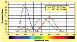 |
| Figure 1: The tristimulus values of the CIE 1931
(2 degrees) and CIE 1964 (10 degrees) standard
observers. These are experimentally and mathematically
derived representations of what the human eye perceives
as red, green, and blue, and are the basis of all
numerical color data. |
The standard observer characterizes the human visual system
as sensitive in three broad and overlapping bands of color.
One of the bands is mainly over the red region of the
spectrum, even if it extends in the blue region, and the
others cover the green and blue regions (see Figure 1). The
values in all three bands for a given wavelength are called
tristimulus values.
The colors we can see extend from
about 380 nm, a deep blue color, up to 720 nm in the red
region. Ultraviolet, which is nonvisible although it is
readily absorbed by the skin, can be found below the 380- nm
limit; going down even further in wavelengths would bring us
to X-rays. On the long wavelengths side, we find the
near-infrared, just above the 720-nm limit, followed by the
mid-infrared around 10,000 nm, a zone used by devices called
"thermal imagers," which can "see" the heat emitted by objects
or persons.
 |
| Figure 2: The geometry of the 2 degrees and 10
degrees standard observers. The eye has more color
sensors in the narrower field of view (FOV) and our
perception of color is not the same as for the larger
FOV. Our color perception decreases steadily for FOVs
larger than 10 degrees. |
The tristimulus values are not the wavelength response of
the eye, although they can be associated to such a
characterization, but a mathematical representation of how the
eye and brain process colors of different wavelengths; it is
the basis of how colors are measured. The CIE standard
observer was defined using color patches subtending a 2
degrees field of view (FOV) with the eye (see Figure 2), where
the eye has its highest density of color sensors (cones). This
geometry corresponds well to color patches seen in images
where many colors are seen next to one another. The
computer-graphics world is almost entirely based on the 2
degrees observer.
In 1964, another standard observer
was devised for color patches subtending 10 degrees FOVs with
the eye; the CIE 1964 10 degrees observer. This larger FOV
encompasses almost all the eye’s color sensors (i.e. the human
eye is much less sensitive to color off-axis). It also more
closely corresponds to the perception of large, uniformly
colored expanses such as walls. Although at first sight it
might seem that the CIE 1964 observer is better suited for
painted surfaces characterization, this is not the case since
the two observers describe a measuring method and, as long as
you present results in association with the method, they both
remain perfectly accurate. For instance, if you have a
reference card and a large wall where both are measured as
having the same color coordinates using the 2 degrees
geometry, the wall and card will most likely look the same
when subtending a 10 degrees FOV.
A color without light
is black. A color with light is never the same color. The
perception of a color is influenced by the spectral content of
the light source, the viewing environment, the surface finish,
and your brain’s memory. If you compare a white sheet of paper
held in front of a window at midday when there is a bright
sun, with a similar sheet held nearby so that you can
simultaneously see both, under a 60 W light bulb, the one
under the light bulb will look much yellower. The brain part
comes into effect when you look at these sheets separately at
different moments; in this case you will vow that they are of
the same white. More on that subject later.
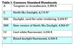 |
| * Correlated
temperature |
In comparison, colors will be perceived differently under
various lights, thus the importance of defining the light
source, the illuminant, in colorimetry terms. Many standard
illuminants have been defined over the years. They are called
by short descriptions such as C (CIE illuminant C), which
stands for "North Sky Daylight, 6,774 Kelvin;" or D50, which
stands for "Daylight 5,000 Kelvin," the latter one often used
for color rendering. The Kelvin is a temperature unit where
zero Kelvin is the absolute zero (equal to -273 degrees
Celsius) and where one Kelvin step is the same as a one degree
Celsius step. A 5,000 Kelvin illuminant has a spectrum that
corresponds to the light emitted by a black body (look at it
as a calibrated piece of steel) heated to this temperature. As
with the stars in the sky or forged metal, the hotter the
temperature, the bluer it becomes. Illuminant D65, a very
common illuminant for computer screens, corresponds to a 6,500
Kelvin temperature and is visibly bluer than D50. Common
standard illuminants are given in Table I.
We now have
the two basic elements of color characterization: a standard
observer and an illuminant. These two combine to give us color
coordinates. Here is the basic setup for color patches
(measured by reflection). A calibrated light is shone on a
color sample. The measurement setup is usually configured in a
geometry that minimizes the amount of light due to surface
reflections. In one of the standard geometries, the illuminant
is positioned at 90 degrees (perpendicular) over the sample,
and the detector is positioned at 45 degrees relatively to the
sample surface; switching the illuminant and detector is an
equivalent setup.
This way, the "tru" color of the
surface is measured, without the portion of the illuminant
that could be reflected by a polished surface acting as a
mirror. In real life, however, you do have more or less of
this effect and you may want to quantify it. This is discussed
in the next section.
|
|
| Figure 3: XYZ color coordinates are obtained by
illuminating a color sample with a characterized
illuminant and processing the reflected spectra with the
standard observer functions. XYZ is considered "raw”
data, the one from which other notations are
derived. |
The diffused light falling on the detector is analyzed in
terms of what quantity of light falls within each band of the
standard observer. The prorated quantities of light in each
band are called XYZ, with X corresponding to the red region,
and Y and Z corresponding to the green and blue regions (this
process is illustrated in Figure 3). "Y" has a special
additional meaning, having been defined in such a way that it
corresponds to the measured luminance of the color, its gray
level. This procedure is described in ASTM E308. Such a
procedure, even though well explained in the ASTM document, is
not trivial if colorimetry is just a tool and not your field
of work. Luckily, most modern colorimeters and
spectrophotometers compute these three coordinates directly
from their measurements.
Let’s come back to our
reference card and wall of a previous section. You are well
aware that the color of a color card, even if this card
subtends a larger than 10 degrees FOV, may look lighter than
the same color applied to a large wall. This is due, in part,
to the colored wall affecting the room lighting (the
illuminant), which results in a shift of the perceived color,
thus the importance of having a common mutually agreed
specification and control method.
Surface finishes cover
the entire range from ultra-matte (flat or lusterless) to
shiny (brilliant or mirror-like). If we start from the same
basic color, increasing the smoothness of the surface will
make it look more and more like a mirror and you will be able
to "see the light" at certain angles.
What this means
in terms of perceived color is that you have a mix of the
"true" color with the color of the illuminant, usually a
variation on white, from yellowish to bluish.
If you
want the color to be uniform from almost all points of views
(both visual and personal), select a matte finish. The color
will look deeper and more saturated. On the other hand, a
brilliant finish may be in order to give a touch of luxury, as
if covered with lacquer. In this case, you should expect to
see a less saturated color than what the measured color
coordinates indicate.
If the gloss effect is
critical—let’s say that its importance is more than what can
be controlled by simple variations of the raw materials used
for the finish (different paint bases)—then you need to
specify a gloss value and a tolerance (i.e. an error range, or
gloss differential).
|
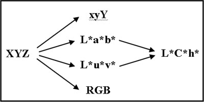
|
| Figure 4: From XYZ, one can derive all the other
standard CIE color notations, as well as RGB. The xyY
representation is most often presented graphically.
L*a*b*, L*u*v*, and L*C*h* are the color coordinates
most used for specifications. RGB coordinates are
dedicated to computer displays. |
Starting with the XYZ data obtained by combining the
characteristics of the colored sample with the ones of the
illuminant, there is a collection of mathematical
transformations that are available to obtain various output
forms: xyY, L*a*b*, L*u*v*, and L*C*h* as shown in Figure 4.
L*a*b* is pronounced L-star, a-star, b-star, and the asterisk
is not a multiplication sign.
It was added to make a
distinction with historically defined Lab, Luv and LCh
notations.
|
|
| Figure 5: The CIE 1931 chromaticity diagram
showing the xy coordinates of the xyY notation. The
labels indicate the wavelength, in nm, and the locations
of specific monochromatic colors. The primaries and the
colors encompassed by the sRGB space, used to display
images on most Windows-based computers, are also
shown. |
These color notations are all equivalent but present the
information in complementary fashions. XYZ values are often
seen in numerical form but seldom, if ever, presented
graphically. The derived "xy"coordinates are, on the other
hand, often presented in diagrams. The xy of the xyY notation
are normalized values, between zero and one, of their XY
counterparts. They are represented in the well-known
"horseshoe" diagram of Figure 5, called a chromaticity
diagram. The region within the horseshoe itself represents all
the visible colors. The colors located on the horseshoe’s
periphery, called the spectral locus, are pure, monochromatic,
saturated colors. The more one goes toward its center, the
less saturated a color becomes (i.e. it becomes whitish,
grayish, or blackish). All illuminants of interest for
practical uses are located in the center region. The "z" of
xyz is seldom shown or given since, as a result of
normalization, x+y+z=1. In addition, by normalizing, the
actual luminance (Y) is lost; this is the reason for including
Y as the third coordinate, instead of "z," when communicating
color data (i.e. we use xyY instead of xyz).
The
chromaticity diagram is very useful in presenting the relative
positions of colors and can also be used to see what colors
will result from mixing two others (for additive colors only,
such as a computer screen, not for subtractive mixes like
paint colors).
However, this color space, as with XYZ,
is not perceptually uniform, and a given separation between
two colors on the diagram corresponds to different perceived
differences depending on their relative position.
|
|
| Figure 6: The L*a*b*/L*C*h* color space. On the
right side we see how the a* and b* vectors are
transformed in C* and h* (chroma and hue angle). On the
left side, we see how a color difference is defined
(more information on color difference will be presented
in Part II). |
L*a*b* and L*u*v* are attempts at making the XYZ (or xyY)
space more perceptually uniform (see Figure 6). L* is the
lightness, the intensity of the reflected light. Where Y
represented the actual reflected energy, L* represents the
perceived brightness, as the eye is not a linear sensor
(exposing it to twice the energy will result in less than
twice the perceived brightness). a* is the amount of red
(+axis) or green (-axis) while b* is the amount of yellow
(+axis) and blue (-axis); u* and v* have similar meanings.
Red/green and blue/yellow are called “opponent” colors; you
cannot perceive blue when there is yellow and vice-versa.
Similarly, you cannot perceive red when there is green.
Representing the colors in such a way is based on our
understanding of how our brain processes colors.
Each
notation, L*a*b* and L*u*v*, has its pros and cons, with
different scaling factors for each variable, except L*, which
is the same for both. But, in practice, L*a*b* is often
preferred for printed color applications and L*u*v* for
applications geared to electronic displays (especially in the
U.K.).
L*C*h* is yet another transformation of either
L*a*b* or L*u*v*, where the data is looked at from the
perspective of cylindrical coordinates (see also Figure 6).
C*, for chroma, or color saturation, a vector obtained by
combining a* and b*, is the extent of the cylinder radius. h*,
the hue angle, is the angle of the chroma vector. L*, the
height of the chroma vector on the cylinder, is the same
coordinate used in the L*a*b* and L*u*v* notations. Finally,
starting with XYZ, you can also obtain RGB coordinates, as
used in all computer displays. RGB stands for red, green, and
blue, the colors of the primaries used on all video monitors
(computers and TVs).
The conversion involves two steps,
the first being a conversion from XYZ to linear RGB, and a
second one, which scales the RGB values to match how we
perceive brightness (called gamma correction), in a process
similar to what is done between the "Y" of XYZ and the “L*” of
L*a*b*. The first step, obtaining linear RGB values, requires
the selection of the primaries, i.e. which colors correspond
to pure R, G, and B (the apex of the sRGB triangle in Figure
5), as well as the selection of an illuminant. As no two RGB
spaces have the same primaries, and often different
illuminants and gamma corrections, the result is that
identical RGB coordinates can basically describe any color,
unless the space characteristics are known.
Why would
you need to be concerned with RGB coordinates, you may ask?
Well, if you want to accurately represent your project colors
in printed documentation, in CAD renderings, or use them on
the Web, you need to know their RGB equivalent.
In many
instances, it is required to obtain the coordinates of a
sample for a different illuminant than the one used for the
original data. For example, your requirement calls for a color
specified in L*a*b* D65 coordinates and your measuring
instrument gives you L*a*b* D50 data. Since color coordinates
are closely associated to the illuminant used to measure them,
the most accurate method is to take the spectral reflection
ratios obtained with D50, and recalculate the coordinates
using the spectral emission curve of D65 with the method
described in ASTM E308 (same standard observer, different
illuminant).
The problem is that often the spectral
data of the sample is not available (a colorimeter does not
give you spectral data, a spectrophotometer does), and the
only information you have is three color coordinates. The
solution is to use an approximate method, called a Chromatic
Adaptation Transform, which applies a matrix transform
directly to the coordinates. Such a matrix can be derived for
each pair of illuminants, such as when going from D65 to D50,
or from C to D50. Some mathematical knowledge is required but
some tools are designed to handle this task
easily.
This concludes the first "theoretical" part of
the article. In Part II you will see examples of how these
multiple notations are dealt with in real life.
Editor's Note:
This is the first of a two-part series. Part II will
appear in the February issue.
After many years of research and development and
project management work in the academic and industrial
sectors, Danny Pascale now does technology assessment and
helps companies bring new products into the market in the
computer and consumer electronics industries. He recently
formed a new company, The BabelColor, dedicated to the
development of colorimetric software tools.
|